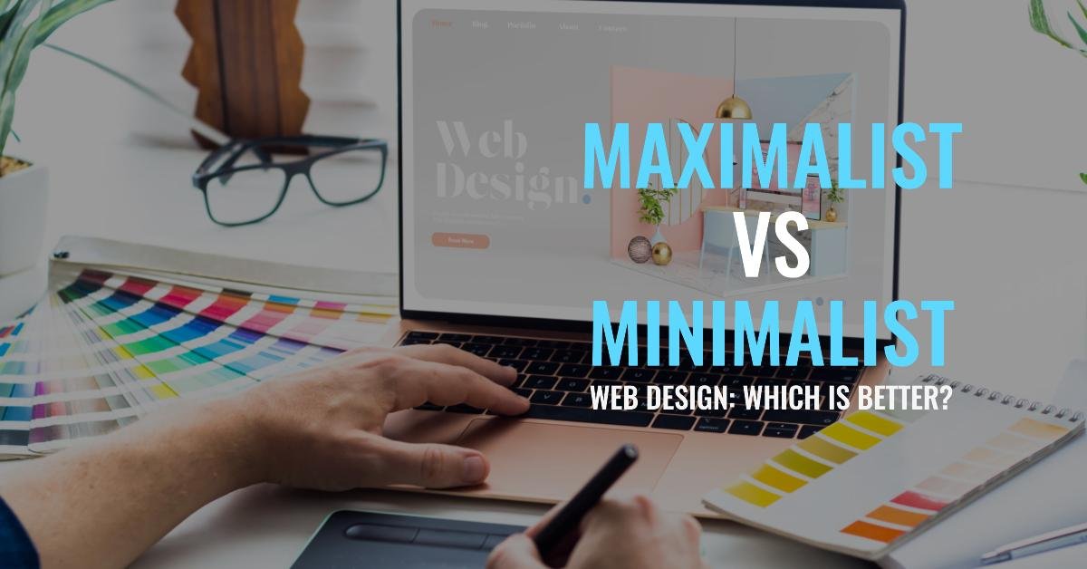
Maximalist and minimalist are two prevalent types of web design in today’s evolving world. Selecting between these two approaches can be a challenging decision. You must know that whatever strategy you adopt, will significantly impact your website’s success.
On the one hand, you have more expressive typefaces, captivating visual elements, bold colors, and louder backgrounds in the form of maximalism. On the other hand, minimalism focuses on straight lines, a flatter background, and simplicity.
Knowing and understanding these differences will enable you to make the right choice for your brand’s robust online presence. Keep reading the article to learn more. It will explain which is a better approach between maximalist and minimalist web design.
6 Differences between Maximalist and Minimalist Web Design
Maximalist and minimalist web designs are two distinct approaches when it comes to designing your site. These two methods differ in benefits, purposes, and emotions. Some audiences might prefer maximalism while others have developed a likeness for minimalism.
The minimalist design revolves around fundamental elements only, while the maximalist web design is more expressive in terms of vision and identity. Let’s focus on the top six differences between minimalist and maximalist web design:
1. What is Maximalist Web Design?
The maximalist web design is characterized by using vivid interface elements, prominent colors, and bold fonts. The trend finds its roots in the beginning of the twenty-first century. The motto of this approach is usually, “The more, the better.” It aims at providing visitors with everything they want to know and catching their attraction immediately.
Its prime elements include striking visuals, contrasting color schemes, distinct textures, and detailed typography. You must seek help from a professional web designer if you want to use this approach more effectively.
2. What are the Benefits of Maximalism?
Maximalist web design is a perfect strategy for businesses that want to be more expressive. It has the potential to show creativity and the brand’s values. That is why it is considered ideal for photography, live streaming, music, and magazine websites. It offers the following benefits:
- Providing a distinctive look
- Visually enriching websites
- Offering more space for innovation
- Giving room for experimentation
- Enhancing user interaction and experience
In addition to the above advantages, this trend also provides you with a higher level of customization. It enables you to communicate your brand’s ethos, message, and tone more expressively.
3. What are the Drawbacks of Maximalism?
Using maximalism web design comes with some potential disadvantages. Making your site look cluttered is the most prominent one. It can make readability and accessibility more challenging for your target audience. As a result, your online store becomes difficult to navigate and more chaotic.
The abundance of visual elements like images and videos can significantly decrease your site’s page load speed. That is why it has a negative impact on your website’s performance. Poor SEO performance is another potential con of leveraging maximalism web design.
4. What is Minimalist Web Design?
The most suitable term to define minimalist web design is the art of reduction. People started using this innovative style in the early 2000s. Soon, it gained enormous popularity due to its aesthetic appeal and straightforwardness. This approach aligns perfectly with the philosophy of, “The less, the better.”
The most prominent features of a minimalist web design include abundant white space, a sophisticated interface, a neutral color scheme, and sharp lines. Using these features has a great say in enhancing clarity and simplicity. It focuses on the elimination of unnecessary elements to reduce clutter.
5. What are the Benefits of Minimalism?
Minimalist web design has always been in trend since its introduction. Businesses that concentrate on conversion opportunities and aesthetic appeal, use this design. It effectively reduces noise on your website, giving it a more professional look. Here is how this design approach can be advantageous:
- Increased page load speed
- Enhanced website performance
- Reduced clutter
- Professionalism and simplicity
- Augmented readability and accessibility
Using minimalist web design is also famous for improving conversions and promoting retention rates. Only an experienced professional can help you reap all these perks by implementing minimalism effectively.
6. What are the Drawbacks of Minimalism?
Like maximalism, minimalism also has some potential cons. One of the most obvious disadvantages of using minimalistic web design is it reduces communication. Some critics also say that adopting this approach can make your site dull.
It can reduce user engagement and interaction due to limited creativity and innovation. Going too deep into minimalism significantly masks your brand’s values and message. Another critical drawback of minimalistic web design is that it decreases your ability to scale up as your site begins to grow.
What Design Approach You Should Use?
Both minimalism and maximalism web designs have their pros and cons. You should consider various factors while choosing among these designs, such as your brand’s audience’s preferences and brand values. Seeking help from an experienced Dubai web design company can help you adopt the right approach.
Learn more:
What Are the Key Benefits of Using AI in Investment Strategies?


